tswd-portfolio
| home page | visualizing debt | critique by design | final project I | final project II | final project III |
Part-1: Web-based Visualization Tools & Data
In this part, I learned to visualize the General Government Debt in 2022 from a web page of The Organization for Economic Co-operation and Development (OECD). I embeded the chart to this page, as follow:
Part-2: General Government Debt-to-GDP Ratio using Tableau
In this part, I learned to visualize using Tableau by downloading the same source of the first part. Then, I adjusted the graph into heatmap using Tableau. The color is orange-blue gradient with the center value is 100, so that above 100 ratio of Debt-to-GDP get a variant of orange, else blue. It will give the audience warning feeling while finding countries with >100 ratio. I also did a data cleansing which is deleting Columbia since it has no data. Here is the data viz:
Part-3: Another Visualization of Debt-to-GDP Ratio using Tableau
This part is about another visualization with the same data sources of part-2. This graph shows how Debt-to-GDP ratios changed in the top 5 countries over the past 20 years. I omitted periods into 20 to provide a more relevant and complete dataset. Something interesting popped up: Israel’s (ISL) numbers behaved quite differently compared to the other four. To make this stand out, Israel is in a different color (red), while the others are in gray. The graph can be utilized for telling another story about historical events in Israel during the specific years, especially when experiencing notable fluctuations. The graph also uses a contextual title which consist of the main idea without redundancy.
Methods of Visualization
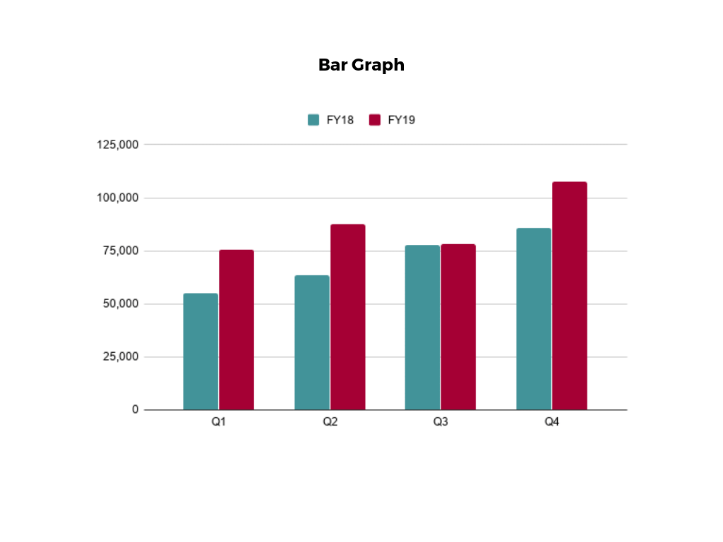
1. Bar Chart

-
Purpose: Visualizes and compares discrete categories with their corresponding measured values.
-
Use Cases: Suitable for displaying and comparing individual values or trends within distinct categories.
-
Importance of Knowing:
- Helps in presenting straightforward comparisons.
- User-friendly for simple data sets.
- Limitations in handling complex datasets and numerous categories.
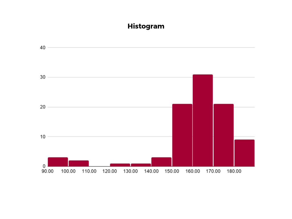
2. Histogram

-
Purpose: Illustrates the distribution of data across a continuous interval or defined period.
-
Use Cases: Ideal for identifying concentration, gaps, or unusual values within a dataset.
-
Importance of Knowing:
- Provides insights into data distribution and frequency.
- Valuable for detecting patterns and outliers.
- For example: Highlights peak and off-peak days by showcasing daily website clicks over a week.
Knowing when to use each visualization method is essential for effectively conveying insights from the data. Bar charts are suitable for categorical comparisons, while histograms are in revealing patterns and distributions within continuous datasets. We need to choose the appropriate visualization methods according to specific data analysis needs.
(Source: https://online.hbs.edu/blog/post/data-visualization-techniques)